TechMagic Academy
Paid features
The best upgrade moments happen just as the user is discovering value. For example: trying to access a faster model, upload a larger file, or generate longer content. The prompt aligns with the user’s motivation. Good upgrade UI prompts emphasise the main value of the Pro feature. Users appreciate knowing what they’d get if they upgraded, without feeling pressured. Transparency around limits and value builds trust.
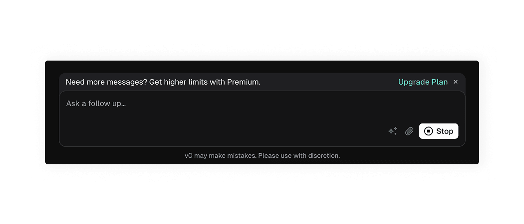
v0 shows an “Upgrade plan” persistent button inside the banner, which communicates the main value in a few words: “Get higher limits”.
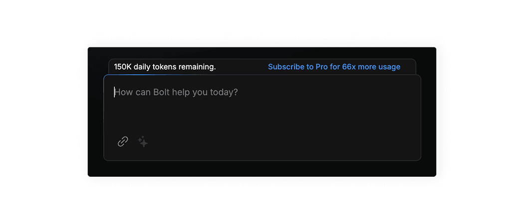
Bolt.new shows an “Subscribe to pro for 66x more usage” persistent button inside the banner, which communicates the main value in a few words. Additionally, it always displays your current daily token balance, which decreases with each use – creating a sense of urgency and motivating users to upgrade.
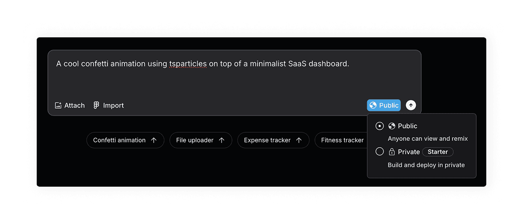
Lovable shows a “Starter” plan tag next to the paid option, which means users will only see it when they’re interested in changing the visibility type.
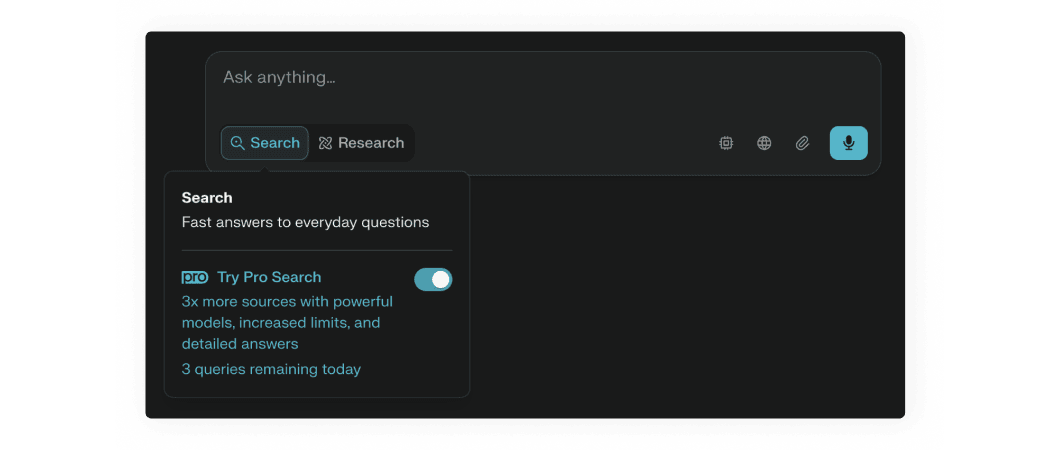
Perplexity shows Pro features with a “Pro” label and communicates the main value in a single sentence. In addition, it provides a “sneak peek” that allows users to try 3 premium queries per day, so they can get a taste of the paid features benefits.
AI patterns checklist
PDF, 220 MB