 Software Development
 Security Services
 Cloud Services
 Other Services


 TechMagic Academy
10 Tips On How To Improve UX/UI Design of a Web Application

Lead Business Analyst at TechMagic, with a background in Project Management and QA, mentor, and speaker. Passionate about Business Analysis and Product Design.

In this article, we share insights on the top 10 tips for great UX/UI in modern web applications. Learn more on how to improve design in 2023.
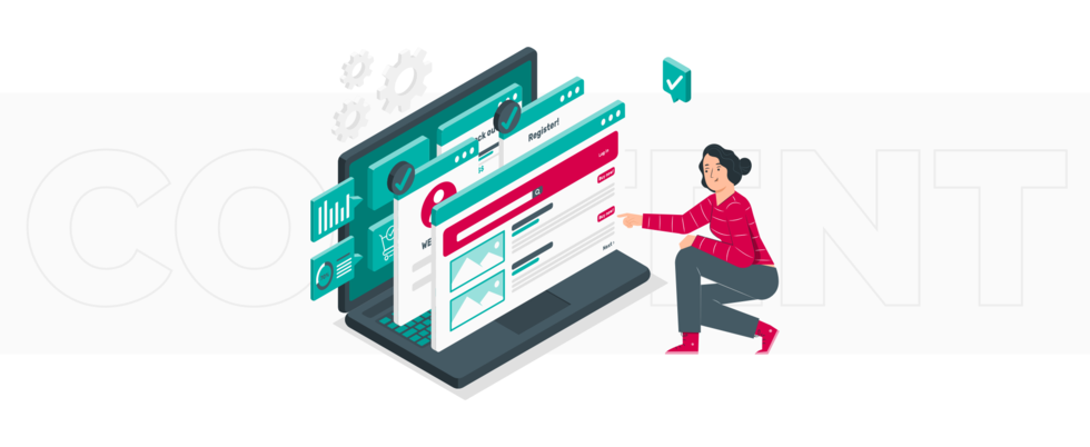
Your web application or a website is the salesperson you have at your disposal 24/7. It creates the first impression on your company and product, transmits values, and answers questions.
Studies prove that a well-designed UI is able to raise your conversion rate by up to 200%. An improved UX design can boost conversion rates up to 400%. That's why it's essential to make your web app not just attractive, but also convenient and user-friendly.
A common aspect of UX is one-time design ― created once and never improved. It doesn't meet new trends and market requirements and remains outdated. As a result, you have an old-fashioned application that is neither informative nor attractive, not convenient for users, and can't stand the competition.
Then again, a complete redesign is money- and time-consuming. Therefore, in this article, we focus on ways to improve UX/UI design that already exists without radical changes. It's a list of ten universal methods of improving the UX/UI design of the web app to make it more user-oriented, and both you and your app prosperous.
Why is a Positive User Experience Important for Your Business?
The User Experience Professionals Association defines user experience as: "Every aspect of the user's interaction with a product, service, or company that makes up the user's perceptions of the whole. User experience design is concerned with all the elements that together make up that interface, including layout, visual design, text, brand, sound, and interaction."
The Nielsen Norman Group defines a great user experience as one that "meets the exact needs of the customer, without fuss or bother."
Simply put, to improve the UX/UI design of a web application means to increase user satisfaction, advance the usability, accessibility, and efficiency of their interaction with the website or app.
UX design focuses on the consumer experience of using your product. The meaning of "product" is broader than just the physical goods or services you sell - it involves the content you create and publish to reach and connect people before they have seen, touched, and got the product.
Whether it’s a website, a web app, or a mobile app - UX is a central pillar the user experience rests on. If it doesn't fit the behaviour and requirements of the target audience, that match between the product and the user will never appear.
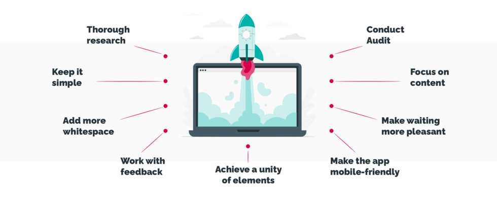
10 Methods to Improve UX/UI Design of Web Application
Thorough research
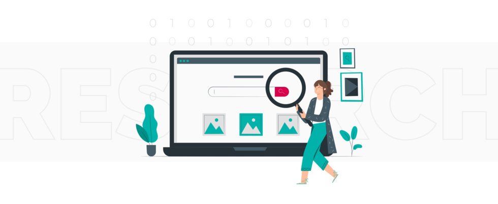
As a first step, conduct thorough user research, ask the right questions. Not how to improve user experience on a website or app in general; start with the definition of the final user.
Knowing your audience, find out what it's interested in. How does it behave after the last update? Clarify people's needs, determine the basic and secondary ones. Identify your product's core value and the punch line. What can you give your user that no one else can?
Then, check your competitor list, add new ones if needed. Analyze their apps and determine what can make your target user go for their products instead of yours. It gives you a priceless opportunity to find inspiration, use someone's knowledge and experience, and stand out among all similar apps in the market. The results of this research will be the basis of how to improve user experience design.
Offering the best user experience is a compelling competitive advantage.
Again, it doesn't have to be costly full-fledged marketing research. Start with:
- Demographic characteristics. They include gender, age, profession, family status, lifestyle, and all related.
- Interests and preferences. Based on demographics data, you can create a pretty good picture of your target audience. Complete it with interests and hobbies. Find as many contact points as possible to build the clearest, ongoing, and fruitful communication.
- Apps they already use. What connects these applications? What reviews do people write, and how do the creators respond?
Use polling, surveys, statistics, Google after all. The future app UX will be built around this information. Pay attention to four types of user research tools UX designers use the most:
- Interview tools give you detailed information about the user's attitudes, desires, and experiences. Dovetail is one of the most prominent examples.
- Survey tools provide you with helpful information about your user experience at scale. Use Hotjar Incoming Feedback and Google Forms for this purpose.
- Persona creation tools show you what types of users are interested in your product and interact with them. The best ones you can use here are Google Analytics in tandem with UXPressia.
- In-house testing tools help you to differentiate what people say and what they actually do with a product by testing it. FitNesse and Bugwolf are pretty good at this.
Remember, it's always easier to create the design people want than to make them like the design you've created.
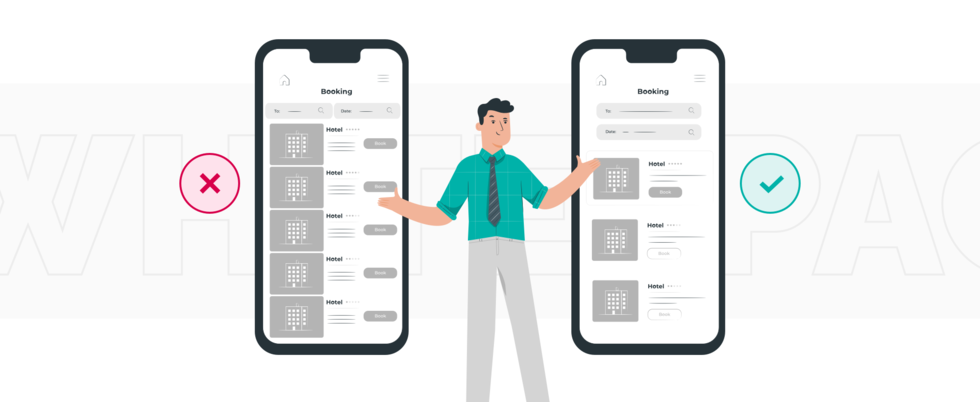
Keep it simple
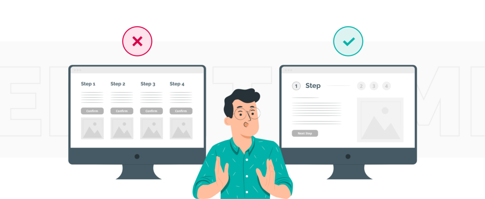
First of all, minimalism has been among the key trends in web design for the last few years and will not lose in positions in 2022. Second, removing all unnecessary components means simplifying the interaction with the app for the user. When they visit, you want them to walk the particular way and do the specific steps. If they have to solve a labyrinth to find what they want, they will be more likely to leave.
Graphic elements should be clickable, facilitate navigation, and carry information about the brand. Here are three fundamental rules:
- One intention per page. If the page is overloaded with information, the visitor will probably be confused, fail to understand its purpose and advantages. You do the exact opposite and push visitors away by wanting to say too much with a single page. Improve web application user interface by using internal linking and connect all the pages but let each be devoted to the particular subject and goal.
- Understandable intent of the page. Navigational elements, blocks, headlines make it easy for visitors to understand the page's goal immediately. Thus, they can stay or move to another one without losing time and wondering what is what.
- Focus on the most relevant information. "You may also like" things always are located at the bottom, below the primary input. For example, if you open a blog post, you can see the related articles below; their icons are smaller and don't distract you from the subject you've opened to read — the same works for product pages in online shops.
Add more whitespace
The simplest and most universal way to improve user experience design is by adding white space. Surprisingly, it's neglected too often in favour of complex graphics solutions. Nevertheless, even a little white space can change the entire picture, shift the accents, and bring the visitor closer to decision-making.
Don't take the white space literally. Contrary to the name, white space doesn't just apply to the color white. Instead, it applies to any areas of a design not taken up by other elements, such as text, photos, or illustrations. White space can be any color, as it refers to the background of the design, according to Canva’s definition.
These techniques can be used:
- Increase the line space. It improves readability, especially for mobile interfaces.
- Increase paragraph space. That raises the chances for the text to be read and understood, not ignored and scrolled.
- Group related items. You can use visual elements for this purpose, but try a "less is more" approach; you may be pleasantly surprised.
Achieve unity of elements
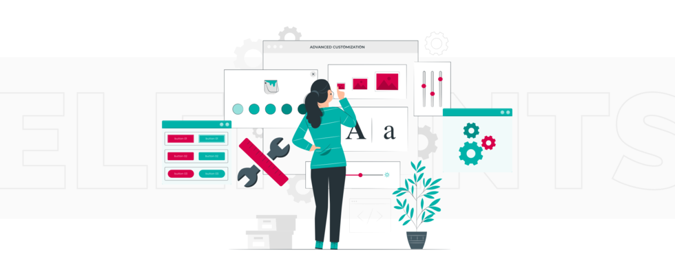
Unity can be visual and conceptual and helps to improve user experience design drastically. You achieve visual unity when all design elements support the same visual theme. In the case of a conceptual one, elements of content support the same subject matter.
All elements should have their roles and be located thoughtfully and strategically. Get rid of ones that don't contribute to the whole objective. But in turn, removing elements that are essential parts of the entire picture breaks the design. Make sure to be precise, so nothing is lost.
The most common and robust method for achieving unity is using the Gestalt principles of visual perception. They are based on the human tendency to see things in groups and patterns and are highly relevant in UX/UI design.
The most potent principles:
- Proximity means that elements that are closer to each other appear more related.
- Similarity refers to the fact that elements that look alike appear related to each other.
- Uniform connectedness means grouping elements with common areas or connecting lines.
- Good continuation refers to grouping by alignment, whether straight or curved.
- Common fate means that elements that move or even point in the same direction appear more related.
Colour and contrast are also of enormous importance. Several tools, such as Contrast and Colorsafe, will help you check the sufficiency of the colors you use, contrast, etc. Make sure colour-blind users can easily read your app.
Basic tips:
- Background colours are muted.
- Blue is used for text links.
- Red is always for warnings or mistakes.
- CTAs require a strongly contrasting hue that stands out from the rest.
Work with feedback
A business's challenge is always listening to what users have to say about the product. It's fair for design as well. Ignoring this rule means deliberately depriving yourself of the opportunity to become the better fit for your target audience.
Some statistical data on the topic:
- 70% of companies that deliver best in class customer experience use customer feedback.
- ESPN.com revenues jumped 35% after they incorporated suggestions from their community into their homepage redesign.
- One satisfied customer can lead to nine referrals.
- 13% of unhappy customers will share their disappointments with more than 20 people.
- It is 6-7X more expensive to attract new customers than to keep existing ones.
A simple way to obtain user feedback is to add a relevant form to your app so it'll be delivered right to your email. Questions can be the most different, for example:
- What would you like us to improve?
- What features would you enjoy in the next update?
- What did you like/dislike the most?
- How would you rate your app?
- What are the chances of you recommending it?
Collect and evaluate the outcomes, compare them with current app design trends and your objectives. For instance, if 70% of respondents claim it's difficult to find a specific page, it's time to add a search feature or improve the navigation.
Using an online survey tool similar to Survicate, you can go through the detailed investigation, using all needed filters, and obtain the detailer report for use in the future.
Another great idea is to have a so-called feedback buddy: someone experienced in the design field to give you honest and informative feedback and point out your strengths and weaknesses like a partner or an independent consultant.
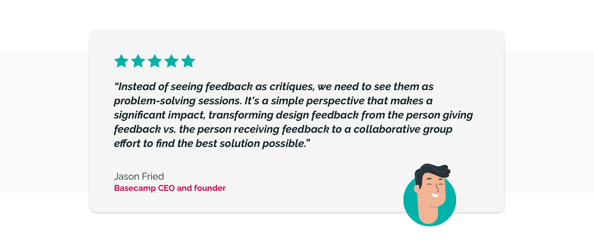
Instead of seeing feedback as critiques, we need to see them as problem-solving sessions. It's a simple perspective that makes a significant impact, transforming design feedback from the person giving feedback vs. the person receiving feedback to a collaborative group effort to find the best solution possible.
Jason Fried, Basecamp CEO and founder
Make waiting more pleasant
It's a task for developers to pay attention to minification and caching for improving the app performance. As a designer, you have to consider how the UI will look while in a loading state.
You'll inevitably face situations when reaching the highest performance won't be possible, slow internet connection, for example. Try to make waiting as pleasant for users as possible. Create skeleton screens - mockups of text, images, or other content elements.
Those are blank versions of pages where the information is gradually loaded. We are used to seeing animated spinners everywhere. The problem with them is that they focus users' attention on loading and waiting. By contrast, skeleton screens are more about progress and action.
This is called perceived performance. The idea is that users are more loyal and patient and think of a system as faster if they can anticipate content when it's not loaded yet. It may be called managing users' expectations.
Companies like Facebook, LinkedIn, Slack, and others actively use this.
Focus on content
At first glance, it seems specifically a copywriter's and illustrator's area of responsibility, but you should work as a team. Speak visitors' language, make every page winning. Use your content as a tool that helps users to understand which step should be taken next. Add a bit of humour; it's very welcome now.
The user experience depends a lot on the text and illustrations. This enormous task requires an individual approach to your specific audience rather than following some general rules. Even if the interface is user-friendly, the page itself seems attractive, and you've used all the abovementioned tips, using language not natural to your target audience could wipe out all your effort.
Make the app mobile-friendly
More than 50% of web traffic comes from mobile devices. As such, if your web app isn't mobile-optimized, users are five times more likely to abandon it. So, you're shutting out your potential customers by not optimizing your app for the best mobile experience.
Keep in mind that search engines are your visitors too, and they scroll through both the desktop and mobile interfaces. A mobile-friendly app hugely impacts indexing; your SEO department will agree.
Essential mobile user interface design tips:
- Locate all buttons, especially the CTA, in the middle.
- Make sure the information is fully displayed on the screen in vertical and horizontal mode.
- Allow taking actions in one click. Most users operate the phone with one hand.
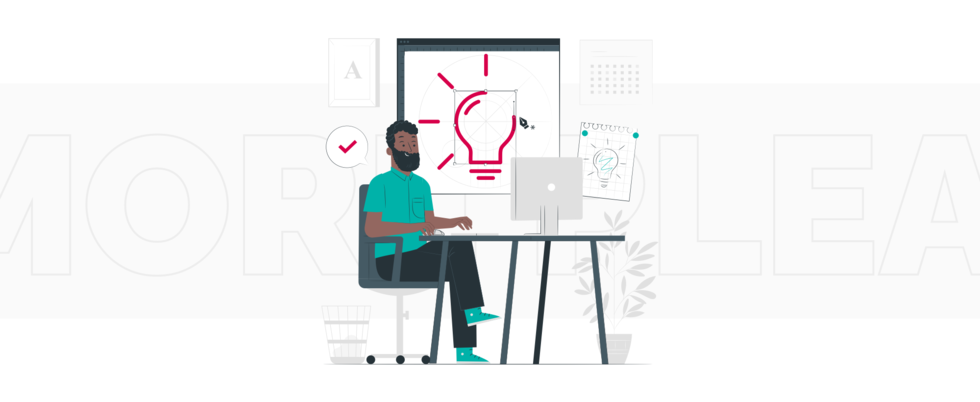
Conduct Audit

Comparing with a previous version, evaluating what's been done, drawing the first conclusions - these steps are essential, especially for long-time projects. New ideas emerge, and trends change while the work is in progress. Periodical reviews and analyses allow implementation changes and make your final UX even better and 100% user-oriented.
An excellent suggestion is to take a day off and then review your work with fresh eyes. It's suitable for writers, illustrators, and also for designers. And never forget to evaluate your page from the user's point of view; it’s not even advised, but a necessity.
Our Experience in UX/UI Improvement
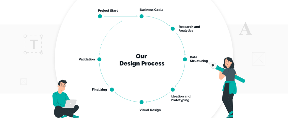
Our strategy of improving UX/UI design combines the most popular and recognized practices and our vision and experience. A key point is an individual approach: we don't just work with a client’s team; we become a part of it, dive into details, and analyze them.
During the improvement of web design, application features, pros, and cons are thoroughly analyzed. We carry out the market research, analysis of user personas and involve business analysts in the process. The main task of changing the UX/UI is not updating the appearance and not making changes for the sake of change. Qualitative changes in design are always noticeable for marketing and sales departments.
Conclusion
The core of good UX design is making it work for both your users and your platform with UX/UI design services. A well-designed UX is all about leading a user to the final point ― the data they need while cutting off everything that might stand in their path and distract them. To figure out how to make better UX/UI design, you need to understand clearly what your user wants to achieve with your app and what you want to show them on their way.
If your users struggle with finding something, it doesn't exist for them. As a business owner, you should strive to create interfaces and interactions that are intuitive and user-friendly. We know well how to improve the UX/UI design of web applications and, at the same time, the likelihood that users can experience and use your content and characteristics by making the interfaces more discoverable.


 linkedin
 facebook
 twitter


