 Software Development
 Security Services
 Cloud Services
 Other Services


 TechMagic Academy
Top 3 Examples of UX in Healthcare Apps From Worldwide Companies

Lead Business Analyst at TechMagic, with a background in Project Management and QA, mentor, and speaker. Passionate about Business Analysis and Product Design.
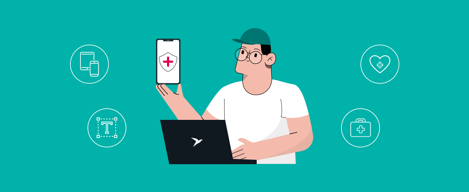
What might be simply irritating in an average app's UI/UX design can be detrimental in health and well-being apps. No, it’s not just about a pretty picture; UX design in healthcare apps should be a top concern for application developers.
So if you’re a startup, we’ve gathered some examples of the best UX for healthcare apps to guide and inspire you.
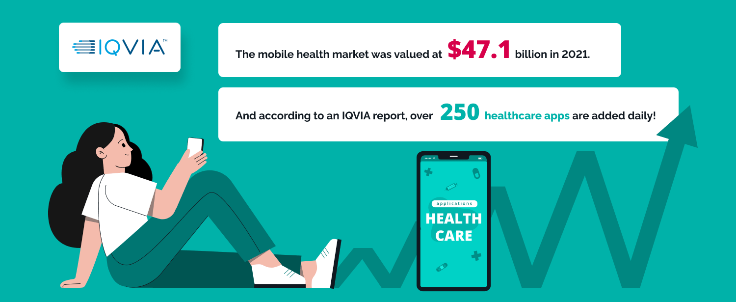
By the way, kudos for picking such a promising niche: the mobile health market was valued at $47.1 billion in 2021. And according to an IQVIA report, over 250 healthcare apps are added daily! It must be hard to stand out, but great UX/UI design and development companies in healthcare can do the trick and make more users fall in love with your product.
Now, back to the examples we’ve picked.
They are three different apps with millions of subscribers and thousands of positive reviews. And believe us, they have a lot to say about the best UX in healthcare applications.
Examples of the Top UX in Healthcare Applications
Let’s make sure we’re on the same page: UI is the look, and UX is the feel of the application. In this piece, we’ll specifically focus on what makes the “feel” of these apps so appealing.
We analyzed each app against the seven principles of UX developed by Peter Morville, a pioneer of UX. They are:
- Usefulness. Is the app useful? Does it have a purpose?
- Usability. Can users reach their goals with minimal effort?
- Findability. Do the structure and logic of the app help users find what they need quickly and easily?
- Credibility. Can users trust and believe what the app is saying?
- Desirability. Does the identity make the app desirable to the users?
- Accessibility. Is the app accessible to people with disabilities?
- Value. Does the app bring value to users?
Now, keeping these principles in mind, let’s look at three examples of UX in healthcare apps. They all follow the leading UI/UX trends for 2022: using a lot of illustrations, animated effects, passwordless entry, dark mode, and futuristic bright colors.
MyTherapy
The app is a pill reminder and medication tracker with a vast audience: over 4 million users and 80,000+ reviews averaging 4.8 stars. An app that became so prominent needs to have great UI/UX design. Let’s take a closer look.
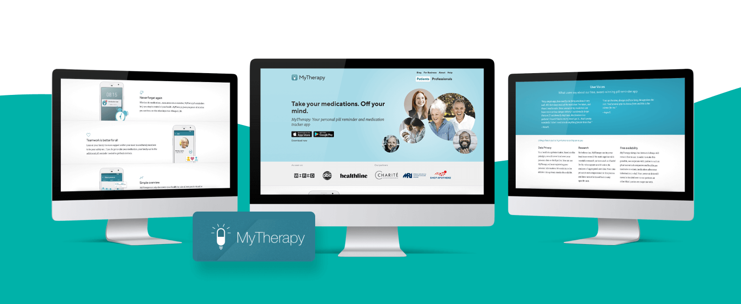
MyTherapy welcomes you with the tagline “Don’t forget to take your pills.” When you log in, the big button in the center offers to add the first reminder. The gear wheel in the upper right corner allows filling your profile with additional information. Four tabs at the bottom show reminders, allow tracking your progress, adding symptoms, pills, activities, and more. Plus, the app shows medications in pharmacies near you.
Read also: Secure Payment Processing Solutions for Telehealth Businesses
Now, let’s look at MyTherapy’s UX.
- Usefulness: It reminds you to take your pills, helps find them nearby and connect with people who have the same prescriptions.
- Usability: The clean user interface improves the UX: everything is clear and to the point.
- Findability: It has pretty good navigation: the primary purpose is centered, and all additional functions are easy to find in the bottom tabs.
- Credibility: The app doesn’t ask for too much personal information or require you to log in to use it. It also allows you to turn on data encryption for an additional protection layer.
- Desirability: The app was designed to be used several times a day by people with different health issues. The color palette is calming; the UI is simple.
- Accessibility: MyTherapy is compatible with Apple VoiceOver and Android TalkBack and was one of the first apps compatible with Siri Shortcuts.
- Value: The app is excellent at solving the problem of medication tracking for occasional users or people with chronic illnesses.
Verdict: The app does a great job. The user experience is simple, perhaps even too simple for a Gen Z, but older people will definitely appreciate it.
Welltory
The next among the healthcare apps with the best UX design is Welltory.
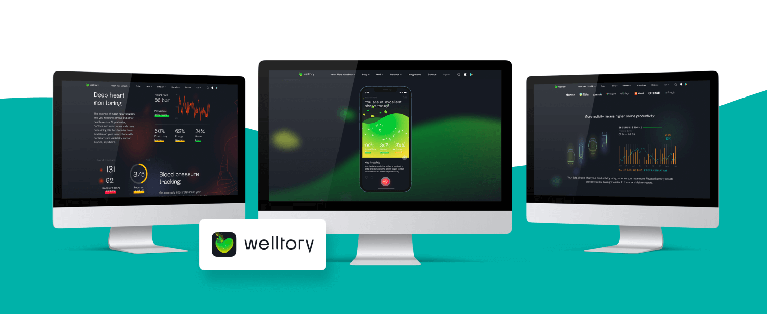
Cardiovascular diseases are the leading cause of death worldwide, and the worst part is that most of them are preventable. Welltory is focused on managing heart-related data and activities with 4+ million downloads and 50,000+ five-star reviews.
After installation, the app lets you connect a smartwatch or fitness tracker, but you can still interact with it if you don’t have one. Then, the app shows you quick tips that look more like messages from a friend. The tips change every time you log in.
Overall, the UI/UX design is sophisticated, with many cartoon-styled details and pleasant slow animation. After filling in a short form, the app lets you measure your blood pressure and heart rate. And when you get the results, it gives you tips on how to improve them.
Read also: 11 Mobile App Design Trends to Follow
Now, let’s look at Welltory’s UX.
- Usefulness: The app provides useful tips on avoiding the leading cause of death worldwide. So yes, it’s pretty useful.
- Usability: The overall structure is clear. Bright colors and elements don’t distract the user.
- Findability: The app has a nice navigation system: the primary purpose is centered, and additional buttons (“My data” and “What’s going on?”) are in the upper right corner. Profile info is on the opposite side.
- Credibility: Each of the many practical tips in this app is based on official or science-proven recommendations (WHO, guidelines of the US Department of Health and Human Services, physical activity studies, etc.).
- Desirability: This app has a great dynamic design, and its popularity shows that people enjoy using it daily.
- Accessibility: When offering a personalized move plan, the app considers the user’s gender, weight, height, age, and chronic illnesses or disabilities.
- Value: The app supports people in taking care of their health, and that’s the most valuable thing.
Verdict: A very bright, modern, and well-designed app with straightforward navigation and a pleasant user journey: you know where you are at every step and where to go next.
BetterMe Mental Health
Another one on our list of the best examples of UX in healthcare applications is BetterMe Mental Health.
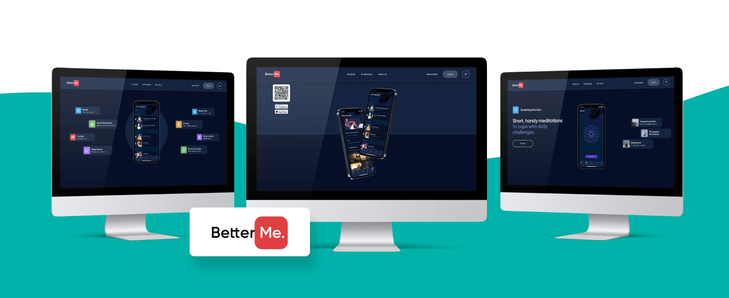
80% of millennials are stressed about money, so it’s not surprising that mental health apps have become so popular. BetterMe Mental Health is one of them.
The app is designed to make you stop and relax. You can log in without registration and choose one or several goals: improve sleep, reduce stress, cope with anxiety, overcome depression, and even express creativity.
After a short quiz, the app creates a personal meditation plan. You’re also free to talk to a professional mental coach using the app’s built-in messenger. Several tabs at the bottom allow you to choose activities. Each tab contains several courses, even in the free version.
Now, let’s look at BetterMe Mental Health’s UX.
- Usefulness: The app helps you take care of your mental health and offers useful tools for that.
- Usability: BetterMe is very user-friendly. Even first-time users intuitively know what to do next.
- Findability: It’s easy to find what a user needs in the app thanks to straightforward navigation.
- Credibility: The app has plenty of relaxation and mindfulness tips for beginners and pros. Plus, an opportunity to chat with a live mental coach makes the app more trustworthy.
- Desirability: This app has a charming design: soothing colors and background tunes make it very pleasant to use.
- Accessibility: The app is compatible with Apple VoiceOver and Android TalkBack. It prompts the user to inhale and exhale using vibration while guided and sleep meditations are voiced.
- Value: The app is excellent for short daily meditations (Moments) as well as longer courses (Journeys) on teaching users to cope with stress, anxiety, trauma, and more.
Verdict: The overall impression is delightful. The app has intuitive navigation, simple but cute animation, relaxing tunes, and calming voices.
Our Experience
At TechMagic, we’ve designed intuitive apps for various industries: HR Tech, MarTech, FinTech, and HealthTech, so we know a thing or two about how to provide UX/UI design services. And our process is just as straightforward as our apps:
- Research: We analyze your competitors, personas, and goals.
- Plan: We devise user stories and scenarios and create the user flow.
- Explore: We brainstorm to create wireframes and a clickable prototype.
- Create: We prepare UI guidelines and elements.
- Finalize: We build all screens and finalize the layout.
- Delight: We create transitions and micro-interactions.
- Analyze: We set KPIs, run A/B testing, and gather feedback.
As you can see, designing a seamless and user-friendly UX is our jam.
Conclusion
The apps we’ve analyzed wouldn’t have been so popular without a great UX. So investing in a carefully considered user experience in the healthcare app is always a good idea with the right custom healthcare software development company. Speaking of ideas, if you have one, we’d be glad to help you implement it. Just fill in our contact form, and we’ll get back to you ASAP.
Who knows, maybe you’ll develop the next “Healthcare Twitter” and sell it to the next Elon Musk for 44+ billion? We can’t wait to find out!


 linkedin
 facebook
 twitter


