
 Software Development
 Security Services
 Cloud Services
 AI Services
 Other Services















 TechMagic Academy




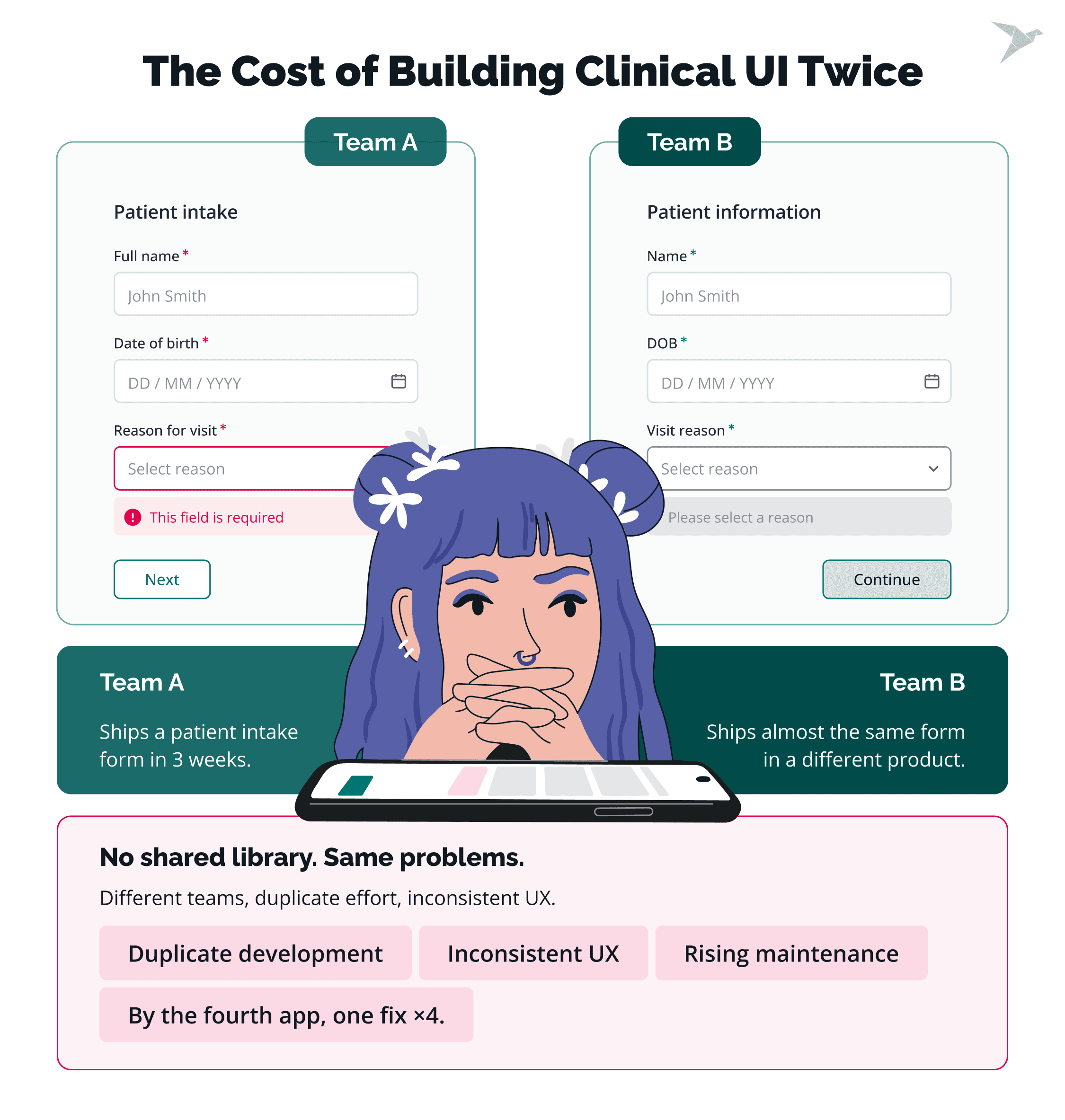
One team ships a patient intake form in three weeks. Six months later, another team ships almost the same form in a different product, with different labels, different error states, and its own openEHR data binding. Both work, and neither one matches the other.
Neither team had a shared web component library for clinical apps to install from. That means duplicate work, a clinical UX that shifts between products, and one fix made four times by the fourth app. A shared library removes that, and in our new article we explain what it takes to build one for openEHR clinical apps.
This post is backed by the expert opinion of Valentin Grudnik, Senior Designer and Design System Lead at Better, where he heads the team behind the company's design system.
Valentin has built and scaled design systems across design, engineering, and product teams. His work covers component architecture, token infrastructure, and design-to-code alignment, with a strong focus on accessibility.
Valentin’s background is in frontend and graphic design, and he is exploring how AI tooling can make design systems more usable and scalable. In this post, he covers what is worth systemizing, how safety-critical displays work, and what makes teams adopt a system instead of forking it.
Key Takeaways
- A web component library for clinical apps is a shared, versioned set of UI building blocks every app installs, so a form or a table gets built once.
- The first layer is design tokens: colors, typography, and spacing held in one place, so one change reaches every screen.
- Clinical components are the layer no open source system provides: flowsheets, observation views, result displays, and severity tags.
- Components bound to openEHR templates and archetypes through a data contract can render any conformant template.
- Framework agnostic technology gives the longest reuse across a mixed portfolio. A single-framework library suits one stack.
- Accessibility belongs inside the components, and a library survives only where one team owns it full time.
What Is a Web Component Library, and Why Do Clinical Apps Need One?
A web component library is a shared, versioned collection of reusable UI building blocks that several apps install instead of each building its own. It holds common UI elements plus the rules for using them: tokens, primitives, clinical components, and documentation.
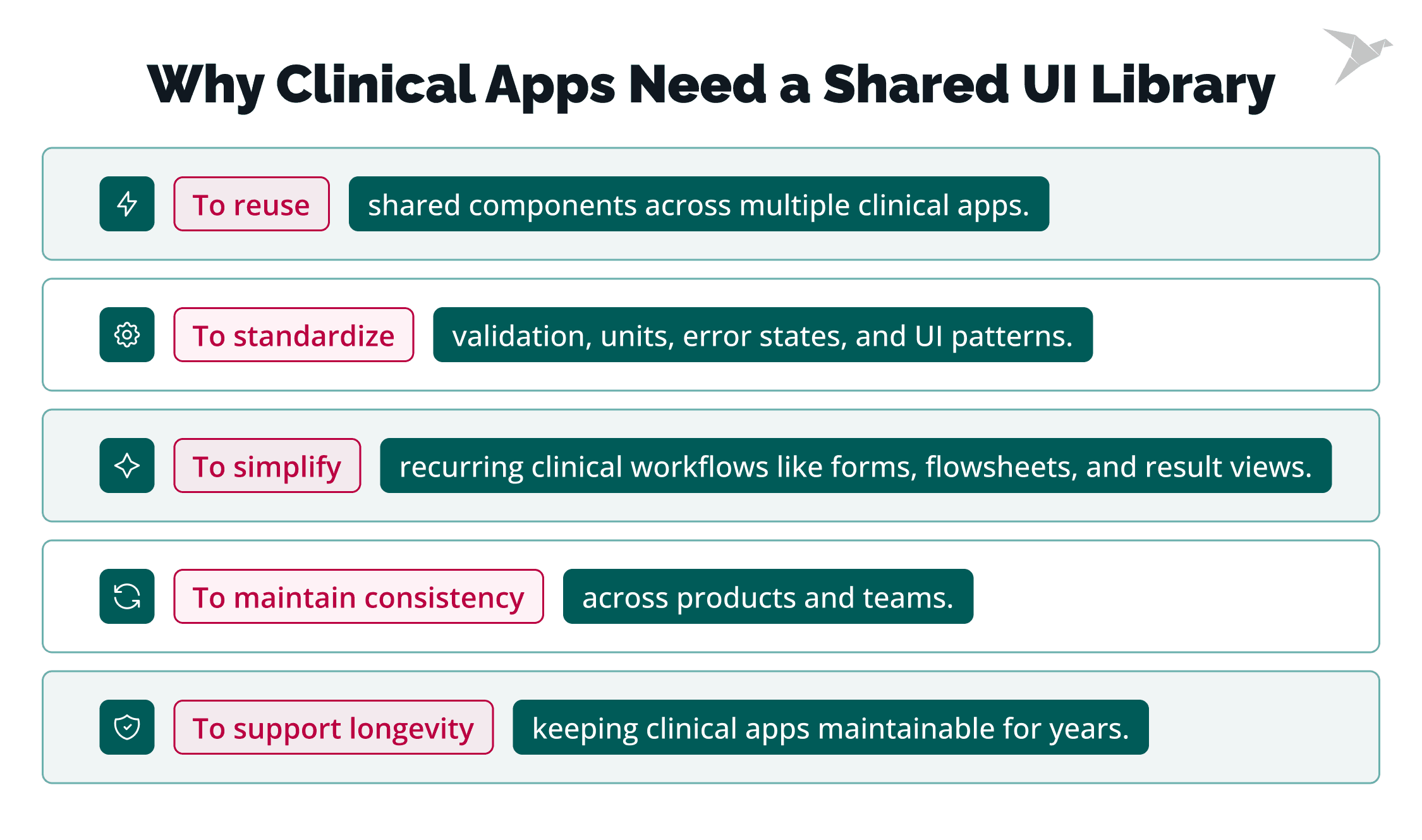
Clinical apps need a web component library because their UI is complex, repetitive, and long-lived. Intake forms, flowsheets, and result views recur across products, each with its own validation, units, and error states. Consistency requirements are strict, and clinical web apps stay in production for years.
Library vs. design system vs. one-off UI
The three terms overlap, so it helps to separate them by scope.
- A component library is the delivered set of components: the code package apps install, and, in most teams, a matching Figma library the designers work from. Both carry the same tokens and the same component list.
- A design system is the library plus everything that governs it: usage rules, design patterns, documentation, accessibility standards, and the people who maintain them.
- One-off UI is a screen or control built for a single product with none of that behind it. It works, and no other team can reuse it.
Scope explains the difference. A library gives teams the same building blocks, a design system gives them the same decisions, and one-off UI gives them neither. Component libraries commonly begin as a folder of shared components inside one app, and turn into a design system once someone owns the tokens, the docs, and the review.
Why clinical apps keep rebuilding the same UI
Without an owner for shared UI, rebuilding becomes the default. Two pressures in healthcare work make it the fastest available answer, and Valentin points to both.

"A lot of times this happens because of short deadlines and edge cases. Every country or even region has its own requirements and specifics, so things are rebuilt or done quickly and then a bit forgotten." – Valentin Grudnik, Design System Lead at Better
Why Do OpenEHR Clinical Apps Drift Without a Shared Component Library?
Drift happens because each team re-implements the same clinical screens and the same openEHR bindings, and no two implementations match. Four forces pull the apps apart, and each one makes the next one worse.
Duplicated UI and binding work across projects
The visible duplication is the component. The expensive duplication is the binding underneath it: the code that reads a composition, walks to the right path, formats the value with its unit, validates the input, and writes it back. Two teams writing that twice produce two sets of edge cases, and they surface in the same places: units, missing values, and fields that can repeat.
Inconsistent clinical UX and data handling
The same clinical value ends up presented and captured differently in each app. One product shows a lab result with its reference range; another shows the number alone. Data handling diverges the same way. One form rejects an out-of-range entry, another stores it. A clinician who works in both products has to learn both. Valentin names the costs directly.
"Developing and designing things from the start means a lot of legacy code and a lot of inconsistencies in the front-end, leading to confused users and a lot of time to change things on a bigger basis. With legacy and repeated code it's really hard to maintain consistency, accessibility and build new features fast." – Valentin Grudnik, Design System Lead at Better
Accessibility varies app by app
Accessibility is decided per component, so without a shared library it gets decided again in every app. One team ships an accessible date field; another ships one a screen reader cannot announce. Conformance then differs by product, which becomes a problem the moment a customer or a regulator asks about it.
Slower releases and higher long-term maintenance
Every change has to be made once per copy. A contrast fix, a new required field, or a change to how a result displays turns into four separate tickets, four reviews, and four releases. Simple changes then take a quarter, and the backlog fills with work one shared library would absorb in a single merge.
A component nobody owns becomes four components nobody maintains.
Valentin sees the payoff landing in two places: consistency and accessibility for end users, speed and maintenance for the teams building the products.
"With a centralized design system, one team supports and updates the components for all the teams, taking care of the accessibility and all the small details that matter." – Valentin Grudnik, Design System Lead at Better

What Should Go Into a Web Component Library for Clinical Apps?
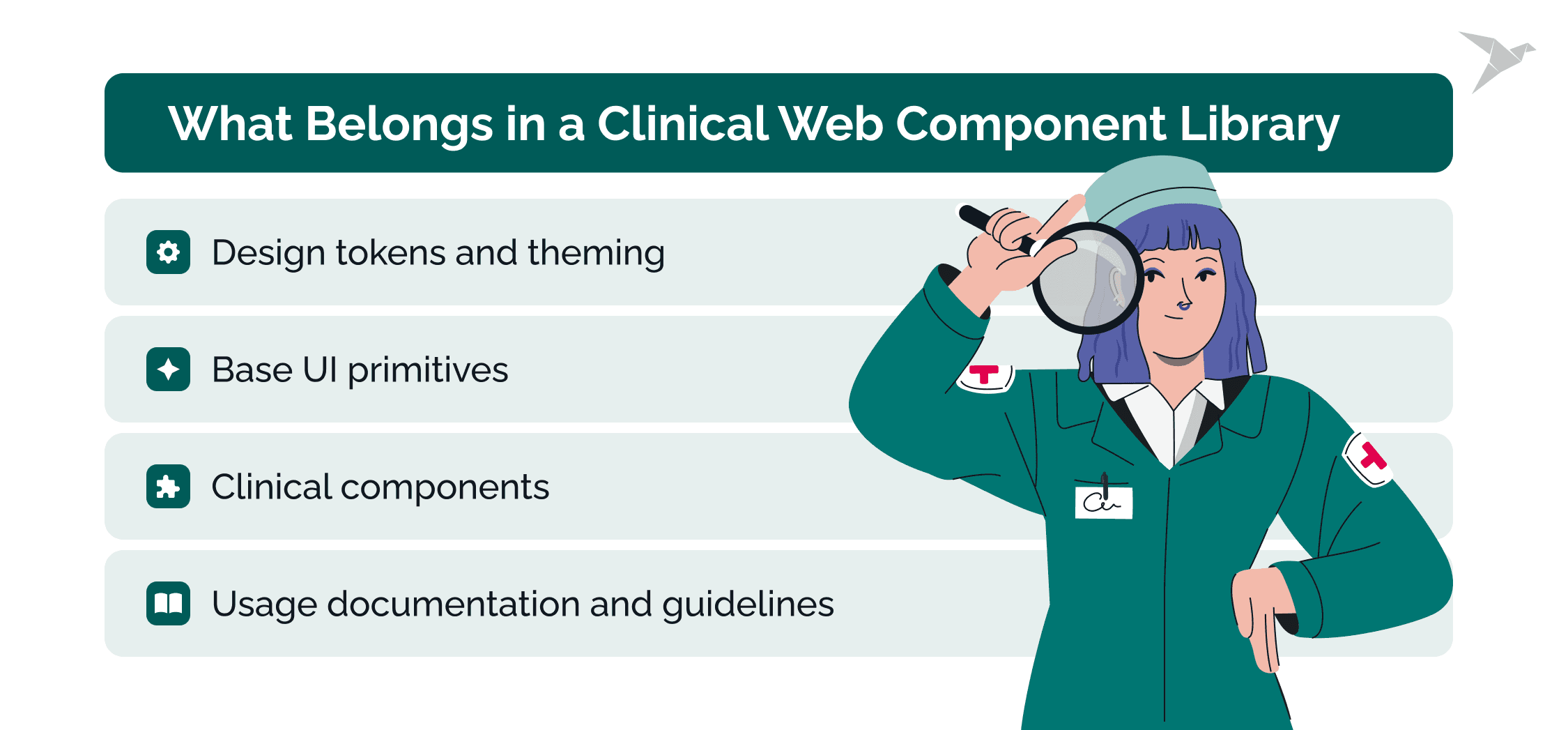
A clinical library holds design tokens and theming, generic UI primitives, clinical components such as forms and result views, plus documentation on how to use them. Each layer depends on the one below, which is also the build order. Let's look at each in more detail.
Design tokens and theming
Tokens are named values for color, typography, spacing, and severity, held in one place and referenced everywhere. Valentin names both design tokens and component tokens as basics: the first holds shared values, the second what one component needs. Because a token change reaches every screen, one token set can carry a customer's branding, a high-contrast mode, or a regional variant without touching a component.
Base UI primitives
Primitives are the generic controls every product needs: inputs, buttons, selects, tables, layout, and icons. They carry no clinical meaning, and they are where accessibility work pays off fastest. One accessible select element, reviewed once, removes the same problem from every form in the portfolio.
Clinical components
Clinical components are the layer no open source base provides. A team can take Material Design or any other system for the first two layers, and none of them will contain a flowsheet, an observation view, or a severity tag.
"Clinical design systems need all the basics as other design systems. What differentiates them are clinical components, which range from displaying patient data to scores and graphs." – Valentin Grudnik, Design System Lead at Better
Which ones to build first? The ones that repeat.
"When components start to pop up in different products, it makes sense to systemize them and make them usable through the applications." – Valentin Grudnik, Design System Lead at Better
Product-specific extensions stay with the product team, and they still utilize the library's tokens, so a professionally designed screen looks like the rest of the portfolio even where the library does not reach.
Usage documentation and guidelines
Documentation ships as part of the library. Each component needs its props and states, a live example, the accessibility behavior it already handles, and the clinical rule for when to use it. That last item is what stops a severity tag being used for a non-clinical status.
How to Architect the Library for OpenEHR Data?
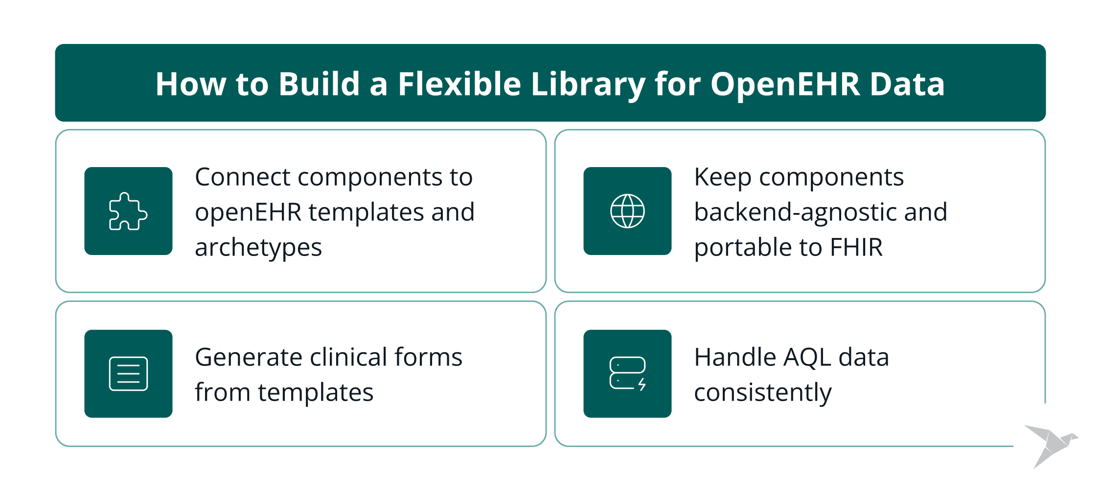
Keep components decoupled from the backend and bind them to openEHR templates and archetypes through a data contract, so one set renders any conformant template. Only the adapter communicates with the server. We explain each part below.
Bind components to openEHR templates and archetypes
The openEHR specifications separate the technical model from the clinical content, with the archetype methodology coming from health informatics. The Reference Model defines the generic structures, archetypes describe one clinical concept as a maximal data set, and templates constrain them to one form. A component binds to a template path, so its contract is defined outside the codebase, and public models keep an openEHR approach portable.
Render clinical forms from templates
An operational template is the flattened, machine-readable version of a template, carrying every path, data type, value set, and constraint a form needs. A renderer walks it and maps each data type to a control, so adding a field changes the form with no frontend release, provided its data type already has a component.
Work with AQL and the data shape it returns
AQL (Archetype Query Language) queries openEHR data by archetype and template paths, and results come back shaped by those paths. The query defines the columns, so a generic table component gets configured rather than coded. One caveat: unless the query selects sub-paths, a quantity arrives as a Reference Model object with a magnitude and a unit, so decide early which layer flattens it.
Keep components decoupled from the backend (and portable to FHIR)
Put the mapping in an adapter and hand the component a plain view model: a label, a value, a unit, a range, and a change handler. The component then needs no knowledge of openEHR, so the same library can serve openEHR systems and a FHIR API, with the adapter absorbing most of the difference. Valentin makes the same point about architecture decisions.
"Think about the future when you start to make architecture and decisions. It's better to take it slow and steady than do big refactors and breaking changes later." – Valentin Grudnik, Design System Lead at Better

Which Technology Should a Web Component Library for Clinical Apps Use?
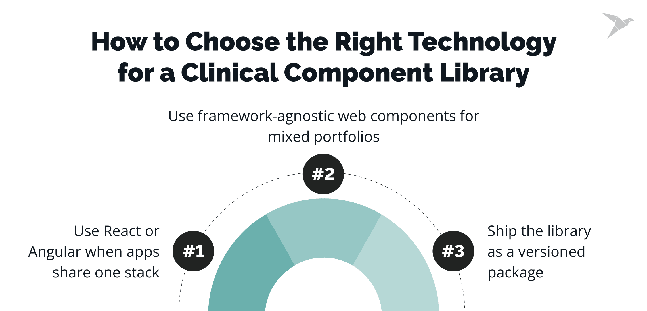
For a portfolio running on different technologies, framework agnostic technology gives the longest reuse. A web component library built on web standards outlives framework cycles. Here is how the choice breaks down.
Choose framework agnostic web components for a mixed portfolio
Custom elements are a browser standard, so a component is plain HTML, CSS, and JavaScript that runs in any framework. Lit is a small library for standards-compliant web components, around 5 KB. The catch is accessibility: labels and errors are wired inside each component, because references do not cross the shadow DOM tree.
Choose a React or Angular library when every app shares one stack
A full React component library is faster to start and simpler for React developers. The trade-off is reach, because it ties the library to React's virtual DOM and release cycle. React 19 added full support for custom elements in December 2024, so a React app can now consume a standards-based library cleanly if that trade-off matters later.
Ship either choice as a versioned package
Ship from a monorepo as a versioned npm package, with separate entry points, so nobody waits for a complete library. On the standards route, styles and functionality encapsulated inside the shadow DOM mean a component looks identical in any host app, and thin React, Angular, and Vue wrappers give developers a native framework experience in their own stack.
How to Make Clinical Components Accessible and Safe?
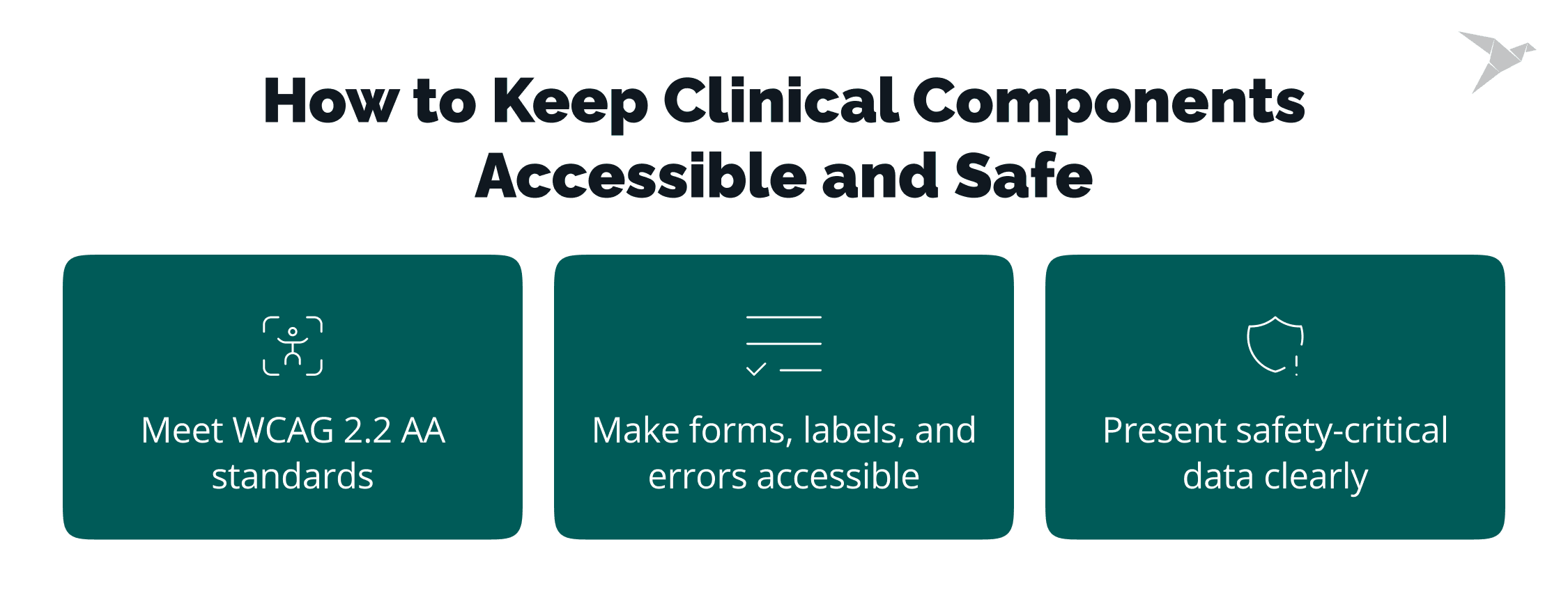
Clinical components have to meet accessibility standards and show safety-critical data without ambiguity: accessible forms, labels, and error states, and rules where color is never the only signal. These components present and capture data, and clinical decisions stay with the clinician.
Meet WCAG 2.2 AA in clinical UI
WCAG (Web Content Accessibility Guidelines) 2.2 level AA is the practical target for clinical UI, and accessibility itself is now a legal requirement in the EU. The European Accessibility Act has applied since June 2025. Meeting that target means building accessibility into each component instead of auditing screens afterwards, which is how Valentin's team runs their system.
"Accessibility is one of the pillars of our Better design system. We try to push for the WCAG 2.2 AA standard. When we design and develop components we take care of the aria labels, we test for screen readers and color contrasts and for color blindnesses." – Valentin Grudnik, Design System Lead at Better
Design accessible forms, labels, and error states
The most common failure in clinical forms is a status carried by color alone, and red and green are the usual culprits.
"Try to avoid them on the same screens and have additional explanation labels or helper texts so users can understand the status." – Valentin Grudnik, Design System Lead at Better
Present safety-critical data (results, meds) without ambiguity
Safety here comes from predictability: a clinician should read a value the same way in every product, which takes fixed rules rather than per-screen judgment. That means settling once how a result, a reference range, an out-of-range value, and an alert are displayed, then holding those rules across every screen and every UI component that shows them.
Better's design system team has written publicly on how a design system for healthcare can ensure patient safety. Severity should look the same on every screen a clinician opens.
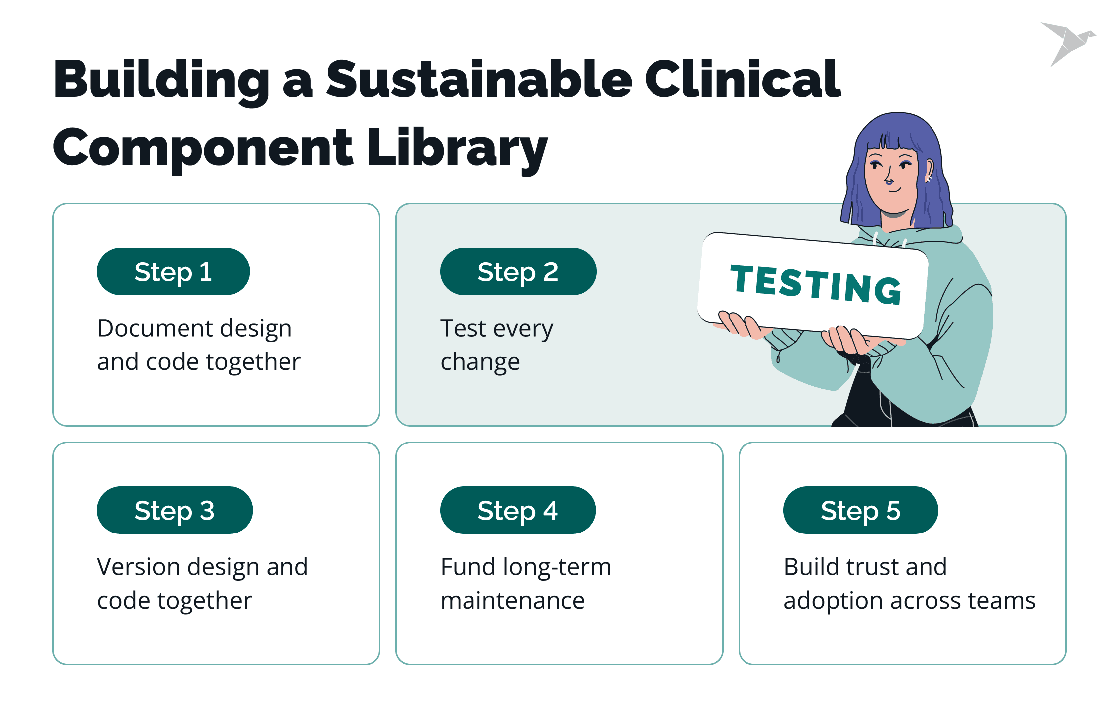
How to Document, Test, and Govern the Library?
A library becomes usable with living documentation, automated visual, unit, and accessibility tests, clear versioning, and a named owning team. Governance separates a library teams adopt from one they fork.
Document it in design and in code
Documentation gives designers and developers the tools and examples to create a screen, and every developed component gets a Figma clone instead of a hand drawn sketch.
"Our design documentation lives in Figma and it is automatically translated into our static Docusaurus design documentation page. And our development documentation lives in Storybook with live examples, code examples and all properties." – Valentin Grudnik, Design System Lead at Better
Test on every change
Three kinds of test matter for a component library, and the point is that they run on every change rather than before a release.
"We test our components with e2e tests, unit tests and accessibility tests. With every new edge case or bug we write new tests and keep them in our pipeline." – Valentin Grudnik, Design System Lead at Better
Version design and code together
Semantic versioning covers the code. Change management covers design too: Valentin's team runs Figma branches for fixes and updates the UI kit on release, because both drift when only one is versioned.
Fund it for the long term
A system built from scratch is a multi-year commitment before it pays back in full, and the payback shows up in what teams stop spending time on.
"It takes a lot of time, trust and commitment to build a design system from scratch. But the long time investment is really important as product teams and designers can think of the user experience and problems a lot more instead of caring about small UI details." – Valentin Grudnik, Design System Lead at Better
Drive adoption across teams
Adoption follows trust, and trust is built by being available. Valentin's team communicates and collaborates with product teams as much as it can, and offers support on usage, maintenance, and questions as they come up.
"I would say having a team working on a design system 100% of the time is a company's trust and commitment to better UX and consistency across products." – Valentin Grudnik, Design System Lead at Better
How Does TechMagic Help Teams Build a Clinical Component Library?
We treat a component library as shared infrastructure with a senior owner, the same way we treat an API. From our experience, the expensive decisions are the per-project ones: a form renderer built for one screen, or tokens living in one app's stylesheet.
On Tiro.Health, a medical form platform, we built accessible clinical UI and patient-intake frontends to WCAG 2.2. We also build custom EHR and EMR frontends, paired with UI/UX design so component behavior is settled with clinical input before implementation.
For a portfolio that is already drifting, our healthcare IT consulting work usually starts with an audit: which components repeat, which bindings are duplicated, and which layer to standardize first.

Final Thoughts
A shared web component library is how clinical-app teams stop rebuilding the same UI. Bind it cleanly to openEHR data, keep it accessible by default, document it, and give it a named owner. Done that way, the library keeps a portfolio consistent and shortens every release after the first.
"Start small, and start with the basics. Colors, typography, icons put into design tokens can really make a difference with small effort. Start to look for patterns and components that are the most used and start with them. And slowly like with lego bricks make a design system. But don't be afraid to fail and make mistakes. Patch release can be done in minutes if the base is set up correctly!" – Valentin Grudnik, Design System Lead at Better
Where is this heading?
- Small teams will lean harder on shared infrastructure. Gartner predicts that 60% of organizations will adopt smaller software engineering teams by 2029, up from 15% in 2026.
- More clinical products means more clinical UI. Statista puts worldwide digital health revenue at US$181.25 billion in 2026, growing to US$271.82 billion by 2031.
- Generated UI will raise the value of a governed library. When tooling assembles the screens, a versioned component set with rules attached is what keeps output consistent.
FAQ

A web component library for healthcare apps is a shared, versioned collection of reusable UI building blocks that multiple apps install as a dependency. Clinical apps benefit because they repeat complex screens such as intake forms, flowsheets, and result views, so building those once keeps behavior consistent.
Components bind to openEHR data through a path-based contract instead of to a specific backend. openEHR archetypes define each clinical concept, templates constrain those archetypes for one form, and a component targets a template path. An adapter maps that structure into a view model.
A clinical component library should target neither directly. openEHR is a modeling and persistence standard. Fast Healthcare Interoperability Resources (FHIR) is an exchange standard, so keep components bound to a view model and put the mapping in an adapter.
Framework agnostic Web Components suit a portfolio where apps run on different frameworks, because web components designed as custom elements work in React, Angular, and Vue. A React component library is the better choice when every app already shares React.
Clinical UI components meet Web Content Accessibility Guidelines (WCAG) 2.2 level AA by handling accessibility inside the component. That covers tested contrast, aria labels, keyboard support, and error states that pair color with an icon or a label.
