
















Every growing product hits the same wall. Three teams ship three versions of the same button, nobody can say which one is correct, and a redesign that should take a week takes a quarter. Digital products get harder to change as they get bigger. That's the problem design systems exist to solve.
The gap between intention and reality is wide, though. In zeroheight's Design Systems Report 2026, a survey of 147 practitioners, only 7% said their design system was fully adopted across all teams. Another 31% called it widely adopted. Most sat somewhere in the middle, with a system that exists and gets used inconsistently.
So this isn't a piece about whether design systems work. They do: 82% of the same practitioners said theirs improved collaboration between designers and developers. It's about what one actually is, what goes inside it, and why most of them stall halfway.
Key Takeaways
- A design system is a single source of truth for how your product looks and behaves. Component libraries, design tokens, usage guidelines, and the documentation tying them together.
- The concept predates screens. Christopher Alexander's pattern language came out of architecture in 1977.
- Design tokens are now standard. 86% of systems include them, and they're what makes a token system portable across platforms.
- Adoption fails on politics more than craft. The top barrier practitioners name is lack of a company mandate, at 73%.
- Only 5% of design system teams measure ROI. If you want funding, that's worth fixing early.
What is Design System?
A design system is a collection of standardized components, design guidelines and documentation that acts as a single source of truth for building consistent user interfaces. It's not a style guide, though it contains one. It's not a UI kit either, though it contains one of those too.
The useful test is whether a designer and a developer can both answer the same question from it. What does a disabled secondary button look like, and what does it do? A design system serves both audiences from one place, which is the whole point.
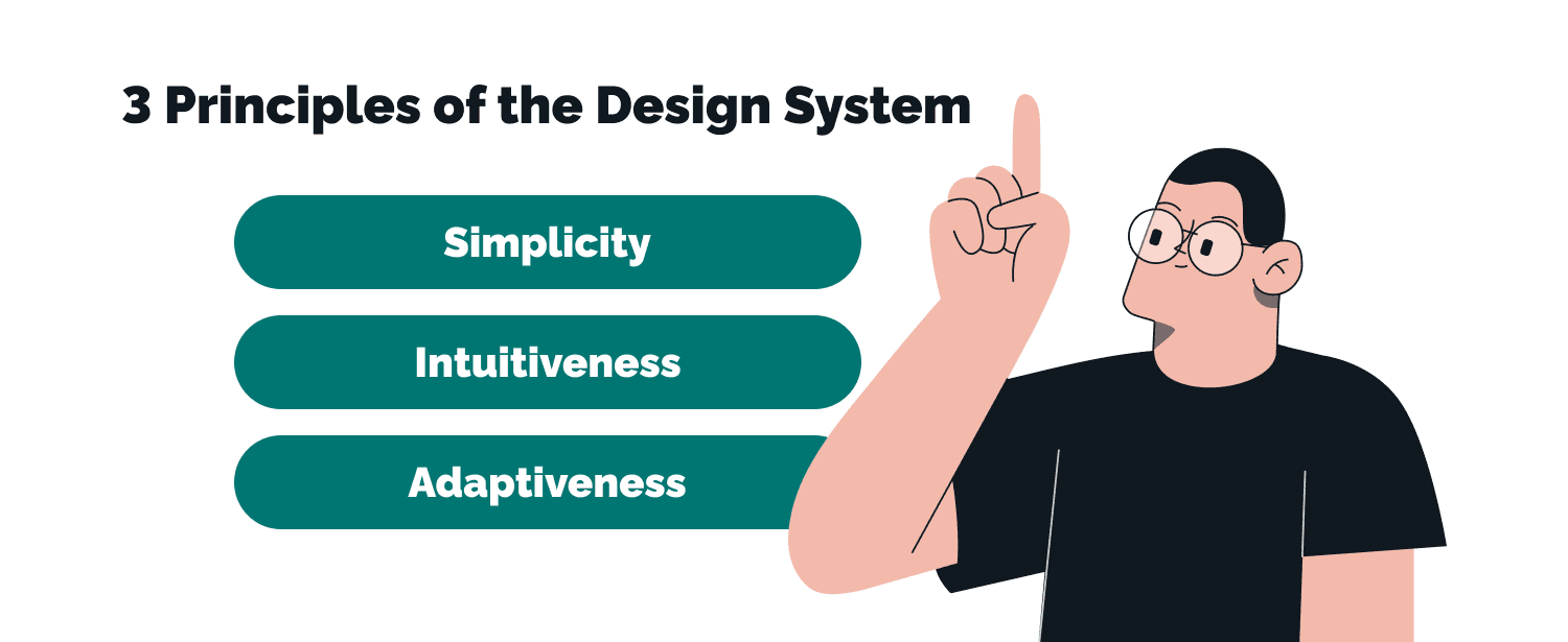
Three principles hold a good one together:
- Simplicity. Every component should be obvious enough that nobody needs a meeting to use it correctly.
- Intuitiveness. Interaction patterns should behave the way people already expect. Novelty is expensive.
- Adaptiveness. Your own design system has to survive new screen sizes, new platforms and a rebrand without being torn up and rebuilt.

With a design system in place, designers can focus on solving specific problems and designing user flows, rather than worrying about the visual appearance of every element. — Sviatoslav Nytka, Senior Product Designer at TechMagic

Where the idea came from
The intellectual root sits in architecture rather than software. In 1977 Christopher Alexander published A Pattern Language, arguing that good buildings and towns emerge from a shared vocabulary of interconnected patterns rather than one-off designs. Each pattern named a recurring problem and a proven response.
Software borrowed the idea twice. First for code, in the design pattern library work of the 1990s. Then for interfaces, as pattern libraries and style guides.
Brand manuals had been doing something similar for print media for decades. A unified language of typography, color and layout, enforced across everything a company printed. Screens just made the enforcement harder and the payoff bigger.
Systematic design reached mainstream interest around 2016, when Google's Material Design and the Atlassian Design System showed that a large organization could publish its design language openly and let hundreds of product teams build against it.
What Goes Inside a Design System
This is where most articles stay vague, so let's be concrete. A working system has four layers, and they stack.
Design tokens sit at the bottom. A token is a named value such as color-surface-primary or space-md, standing in for a hardcoded hex code or pixel measurement. Change the token, and every component using it updates. Tokens are now near-universal: 86% of systems include them, 90% define them in design tools, and 82% carry them into code.
A mature token system layers primitives (the raw palette) under semantic tokens (what a color means), which is what lets one codebase support light mode, dark mode, high contrast and multiple brands. 76% of teams use tokens for visual modes; 63% use them to support different brands from a single system.
Component libraries sit on top. These are the reusable components your product is assembled from: buttons, forms, modals, navigation. In design tools that's a UI kit, usually in Figma, which 97% of practitioners use for design assets. In code it's a package your developers install.
The framework split is decisive here. Among web design systems, 72% ship a React component library, 36% use web components, 28% Angular and 18% Vue. Web components are the hedge if you expect to outlive your current framework. React components are what most teams actually write. Utility CSS frameworks like Tailwind CSS sit alongside either approach, generating classes from the same token values.
Usage guidelines are the layer teams skip and then regret. A component with no guidance gets misused inside a month. Good documentation pairs each component with code snippets, do-and-don't examples, accessibility notes and a plain statement of design intent. It should offer guidance on what the thing is for, not only how it looks.
The documentation platform ties it together. Figma (69%) and Storybook (61%) dominate, with dedicated tools like zeroheight behind them. The Figma community is also worth raiding before you build: plenty of open starting points exist, including full Material Design and Carbon kits.
Benefits of Having a Design System
Consistency, and the brand that depends on it
One centralized resource means typography, color, icons and layouts follow the same rules everywhere. Users don't consciously notice consistency. They notice its absence. And they read it as carelessness.
A faster design process
Update a component once and the change propagates. No hunting through twelve files for the old button. This is where the time comes back, and it's the most efficient thing a design team can do for itself. It compounds as the product grows.
Scale without proportional headcount
Most products get harder to change as they grow. A design system flattens that curve, which is why it matters more at 200 screens than at 20. The zeroheight data bears this out: design system teams at companies over 5,000 people average 11 members serving a designer-to-developer ratio of 1:53. Without a system, that ratio is unmanageable.
Better collaboration between cross functional teams
Design and development work from the same vocabulary, which removes an entire category of argument. It matters: 84% of designers collaborate with developers at least weekly, and according to Figma, 91% of developers and 92% of designers think the handoff process could be improved. A shared design language is the cheapest available fix.
Accessibility built in rather than bolted on
When contrast ratios, focus states and keyboard behavior live inside the component, every product team inherits them. That said, only 59% of systems currently include accessibility guidelines, so it's a benefit you have to build in deliberately. Nobody gets it for free.
Real-Life Examples of Adopting a Design System
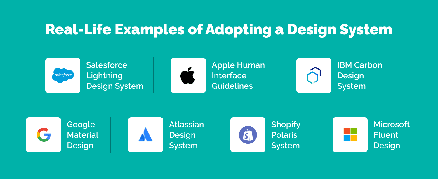
Seven systems worth studying, and what each is actually good at:
- Google's Material Design. The most complete public example. Strong on motion, elevation and responsive layout across screen sizes. Also the most opinionated, which is why products built on it tend to look like Google products.
- Apple Human Interface Guidelines. More a set of platform conventions for iOS, macOS, watchOS and tvOS than a component library. Read it for the reasoning.
- Salesforce Lightning Design System. Enterprise-scale, built for density and data. Excellent documentation of complex patterns most consumer systems never encounter.
- Atlassian Design System. Powers Jira, Confluence and Trello. A good study in one design language stretched across genuinely different products.
- Shopify Polaris. Tailored to merchants running stores. Notable for how much of it is content guidance rather than visual specification.
- IBM Carbon. Open source, and the best public treatment of data visualization inside a design system.
- Microsoft Fluent. Spans Windows, Office and Xbox. The clearest example of a system designed for wildly different input methods.
- Study them. Don't copy one wholesale. You'd be inheriting design decisions made for a product that isn't yours.
an E-commerce analytics app using JS and Serverless on AWS
How to Create a Design System
Step 1. Run a visual audit
Screenshot every one of your ui elements and group them. Teams routinely surface nine button variants and four typographic scales. That inventory tells you the real scope, and it's usually the fastest way to get leadership to fund the work.
Step 2. Define the visual language
Color, typography, spacing, iconography, imagery. Define these as tokens from day one. Retrofitting them later is where design efforts quietly die.
Step 3. Build the component library
Take the audit output, delete the duplicates, and start creating what survives as reusable patterns and page templates in both your design tools and your code. Component completeness is the single strongest predictor of adoption, named by 79% of practitioners.
a BPM app using JavaScript stack and Serverless on AWS
Step 4. Document each component
Every component needs usage guidelines, code snippets, and states. Documentation completeness is named as an adoption factor by 45%, and it's the layer most likely to be under-resourced.
Step 5. Set up maintenance and governance
A design system is a product. It needs a system team with the ability to say no. 83% of organizations now have a dedicated one. Though 61% of those teams say they're understaffed, which tells you plenty about how this usually gets funded.
Decide early who can contribute. Most systems (65%) let anyone on a product team propose changes, with the core team reviewing.
The part nobody plans for
The biggest adoption barrier isn't craft. It's mandate. 73% of practitioners name the absence of a company mandate as what blocks adoption, ahead of weak governance at 55% and incomplete components at 45%.
And only 5% of teams measure ROI. If you want the resourcing to continue past year one, start measuring adoption and delivery speed before anyone asks. More on this in our guide to the key principles to build a design system.
TechMagic's Experience with Design Systems
Two things we've learned building these for clients.
Documentation carries more weight than teams expect. On one project we documented every element against WCAG standards, covering states and behaviors rather than appearance alone. That documentation became the reference designers, developers and product managers all worked from, and it removed most of the back-and-forth at handoff.
Sometimes the right move is adopting an existing system. We integrated the Salesforce Lightning Design System into a client project rather than building from scratch. It gave the team a mature component set and documented interaction patterns on day one, and let them spend their design process on the product's actual problems.
Wrapping Up
A design system isn't a deliverable you finish. It's infrastructure that needs maintaining, and the systems that succeed are the ones treated that way, with a team, a budget and a measurement story. Start with your own product's specific needs rather than someone else's system. Audit what you have, tokenize the foundations, build the components your teams actually reach for, and document them properly.
If you're weighing this up, our UX/UI design services team can help you scope it honestly, including telling you when a full design system is more than your organization needs yet.

FAQ

It removes repeated decisions. Teams stop rebuilding the same ui components and start shipping features, and the product stays visually cohesive as it grows. In the 2026 zeroheight survey, 82% of practitioners said their system improved collaboration.
Faster development, lower cost per feature, and a consistent user interface library your product teams can build against. The value scales with your product. A two-screen app doesn't need one. A two-hundred-screen platform can't function without one.
Anywhere a product outgrows one team. Software, web and mobile, e-commerce, finance, government services. Any organization maintaining more than a handful of interfaces gets there eventually.
Yes, and it's the more common situation. Start with a visual audit, tokenize the foundations, then replace components incrementally rather than attempting a big-bang migration. Retrofitting an existing system takes longer than greenfield work, but the consistency gains arrive sooner than most teams expect.
