 Software Development
 Security Services
 Cloud Services
 AI Services
 Other Services















 TechMagic Academy


UX Writing in Healthcare: How Clear Copy Keeps Patients From Giving Up (+Expert Advice)
Last updated:29 September 2026


Let's imagine the patient opens her hospital’s app to book a follow-up. The form asks for her "preferred encounter type." She isn’t sure if that means a phone call, a video visit, or an in-person exam, so she closes the app and calls the front desk instead.
We build patient-facing products on FHIR-native platforms like Medplum, so we’ve watched copy decisions ripple through onboarding, intake, and consent screens more than once. For this guide, we also spoke with Yuliia Malikova, a senior UX writer whose past work includes high-stakes products at NordVPN.
 In this article, you’ll learn what UX writing means in a healthcare context, the principles that hold up under stress and low health literacy, how to write error messages and consent copy that inform without alarming, and how we approach this work on real patient-facing builds.
Key takeaways
-
UX writing in healthcare removes uncertainty from a task. An anxious or unwell patient has to feel certain before they’ll act.
-
Unclear wording raises task abandonment, causes avoidable form errors, and pushes patients toward a support call instead of finishing in the app.
-
Plain language, one term for one thing, and a calm tone outperform clever phrasing. Test copy against a set reading level instead of a hunch.
-
Error messages and consent copy carry the highest risk in a healthcare product. They need a review path beyond one writer’s best guess.
-
Accessible wording, such as clear labels and screen-reader-friendly text, supports WCAG conformance and accessibility, but it doesn’t make a product HIPAA-compliant on its own.
-
The strongest results come from writing copy inside the design process and testing it with real patients. UX writers participate in UX research and usability studies.
-
UX writing is more conversational and empathetic than technical writing. At the same time, more and more major tech companies actively hire UX writers.
What Is UX Writing in Healthcare, and How Is It Different?
UX writing is the words inside a product interface. Some teams call the discipline content design and the role content designer; the output goes by several names too, UX content, UX copy, or UI text, all describing the words that make up a digital product’s user experience. Buttons, labels, form fields, error messages, confirmations: it’s what guides someone through a task.
In healthcare, that job carries extra weight, because the reader is often stressed, unwell, or unfamiliar with clinical terms. So what is UX writing, in plain terms? The copy should feel almost "invisible, meaning if the user just reads it through quickly and nothing stops their eye."
Yuliia Malikova:
It’s less about what words you use, but rather the purpose each piece of copy has and whether it eliminates uncertainty. To finish a task a user has to be 100% sure they know what they’re doing, they know exactly what’s going to happen next, and they’re feeling safe because there’s no ambiguity.
UX writing vs. marketing copy vs. clinical content
The three get lumped together as "just words," but they do different jobs. Marketing copy sits at the top of the funnel and is meant to create desire. Instructional content steps in when a patient needs a deeper explanation of how something works. UX writing sits between them, doing something narrower.
Yuliia Malikova:
"UX writing helps people buy the product or use it. Its job is to remove uncertainty and guide the user toward completing a specific action. Ideally, they barely notice the copy because it feels like a natural part of the experience. It’s clear, concise, and non-pretentious."
Why the healthcare context raises the stakes
A confusing product description costs a sale. Confusing patient copy costs a completed intake form or a booked appointment. The reader is rarely at their best: in pain, worried about a result, or managing a condition for the first time. Plain, calm wording is what makes healthcare UX design trustworthy, beyond merely usable.
Who owns it: product, design, and clinical working together
Yuliia is direct about ownership, while trusting the product manager’s knowledge of the product itself:
"Writers should definitely own the product wording. Product owners know the product the best. So I would trust the product owner on the actual knowledge about the product, but the best way to communicate their value is on me as a writer."
The healthiest process brings the writer into the product team when the problem is first defined, working alongside a product designer and UI/UX design rather than filling text into a finished layout.
Yuliia Malikova:
"Working with domain experts is a little like being a journalist. You ask questions, check sources, and make sure you genuinely understand what you are writing about. You should trust their expertise, but you shouldn’t copy everything they tell you directly into the design."
Why Does UX Writing Matter for Patient-Facing Products?
Words are where patients succeed or give up. Clear microcopy reduces errors and support tickets; poor wording drives abandonment, erodes trust in a product people are trusting with their health, and adds to the support copy teams have to write just to cover the gap.
What unclear wording costs: abandonment, errors, support tickets
Yuliia Malikova:
"Unclear wording makes the user do work they shouldn’t be doing."
That covers Googling terms, exploring the app in search of answers, or contacting support. She points to the errand rate: how often users must leave a flow to find an answer elsewhere.
Yuliia Malikova:
"Each detour lowers the chance they’ll come back and finish the task. Unclear copy also leads to avoidable errors, like confusing field labels that let users enter wrong information or buttons that make users hesitate and reluctant to move forward."
The scale of that gap shows up in the data. A January 2026 analysis of more than 250,000 people over 50 with a chronic illness found that 61% had activated their patient portal, but only 54% had ever logged in, according to research covered by TechTarget. Usage fell further among readers who don’t use English fluently, down to 21% for Spanish speakers in the study. Wording and translation are part of that gap too, beyond device access alone.
Where copy makes or breaks a task: onboarding, intake, consent, results
Booking, intake, consent, and results screens carry the most risk, because each asks a patient to commit to something they may not fully understand yet. A telemedicine app development flow that never defines "encounter type" or "virtual waiting room" will lose patients at the exact step meant to make care more convenient.
The trust dimension in health products
Yuliia Malikova:
"In sensitive areas like healthcare, this becomes especially important because the user may already be anxious and they want their simple solution. And of course good UX copy lowers the load on the support team. Sometimes there are recurring questions from the users and they can be answered directly in the user flow so it’s important to stay connected with the support team and fix the flow and the copy based on what users actually struggle with."
Good ux for healthcare products tells them, in every screen, that it understands what they’re going through.
We are here to help

What Are the Core Principles of UX Writing for Healthcare?
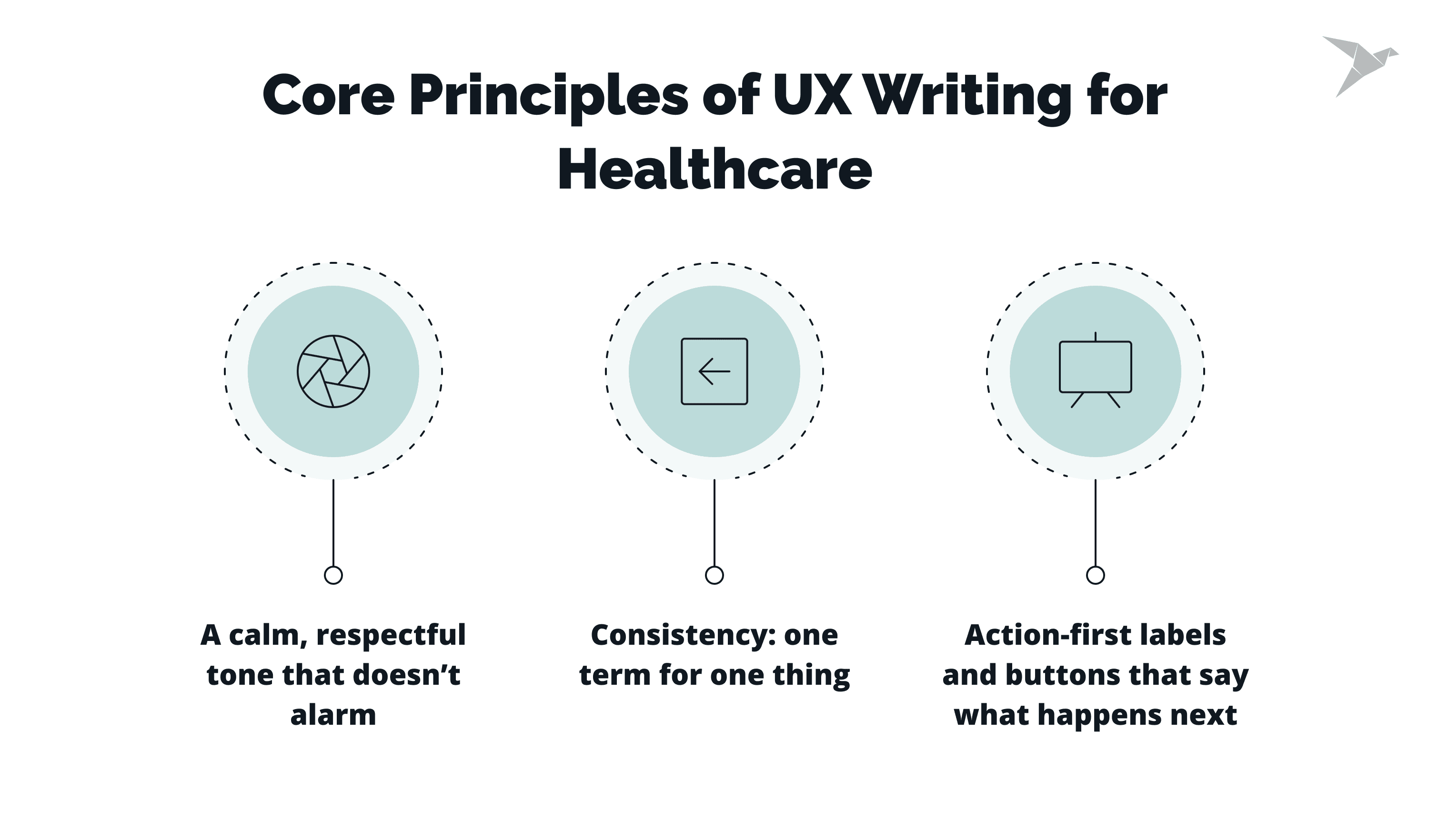
Yuliia works from five durable rules, and every one of them gets harder and more important once the reader is a patient.
Clarity and plain language (target a low reading grade)
Copy has to be clear before anything else. Nielsen Norman Group’s guidance on improving your writing, formatting, and structuring makes the same case: plain language and a scannable structure let a reader act without re-reading. Set a target reading level for patient-facing copy and test drafts against it.
A calm, respectful tone that doesn’t alarm
That’s her third rule, a tone of voice built on being human-to-human:
Yuliia Malikova:
"Your user has to feel that there is a human talking to them on the other side. OK, it’s a product or a service, but ultimately there’s a human speaking to a human. So it can’t sound too–I mean, it depends on the voice and tone, but it can’t sound too mechanical, or cold, or clinical. It’s easier to read and it’s more appealing when it’s more like a human talking to a human.
Also, this is how you express empathy, and human-to-human means we acknowledge that there is a real person out there and what they’re going through and how they’re feeling. And if it’s an error message, we try to be gentle and we try to propose a solution. So it’s just making it as if you are talking to a person. Making it conversational is very important."
Consistency: one term for one thing
Use one name for one action, process, or term, throughout the product. Malikova’s example: pick "visit" or "consultation" and use it everywhere, so patients don’t have to guess whether the two words mean something different. A patient guessing wrong about a clinical term carries real weight.
Action-first labels and buttons that say what happens next
A button should say what happens when the patient taps it, not describe the interface. NN/g’s guidance on short copy, headings, and labels backs the same principle: short copy earns its length by carrying real information, and it should guide users toward the next step without hesitation.
That list is, in effect, a set of ux writing best practices built for a reader under stress. Malikova’s fifth rule, conciseness, ties them together: cut every extra word without losing clarity, tone, or consistency.
Yuliia Malikova:
"I think a lot of people think in UXW shorter is always better. Designers always want it shorter, and they may miss the point where the copy loses its purpose or no longer delivers the intended meaning. Always try to make it shorter, but not at the expense of all the other four."
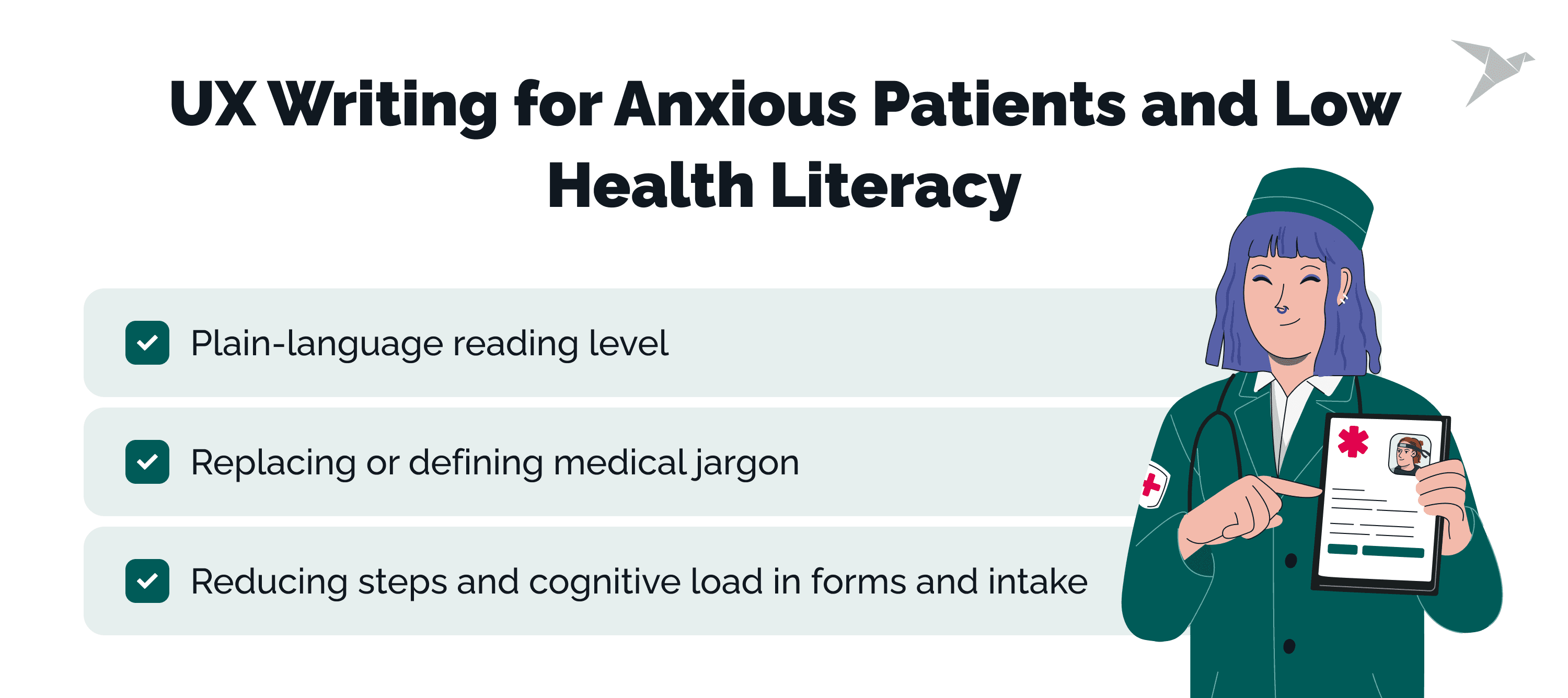
How Do You Write for Anxious Patients and Low Health Literacy?
You write for the reader on their worst day: assume stress, distraction, and unfamiliarity with medical terms, and build wording that still works under those conditions.
Set a plain-language reading level and test against it
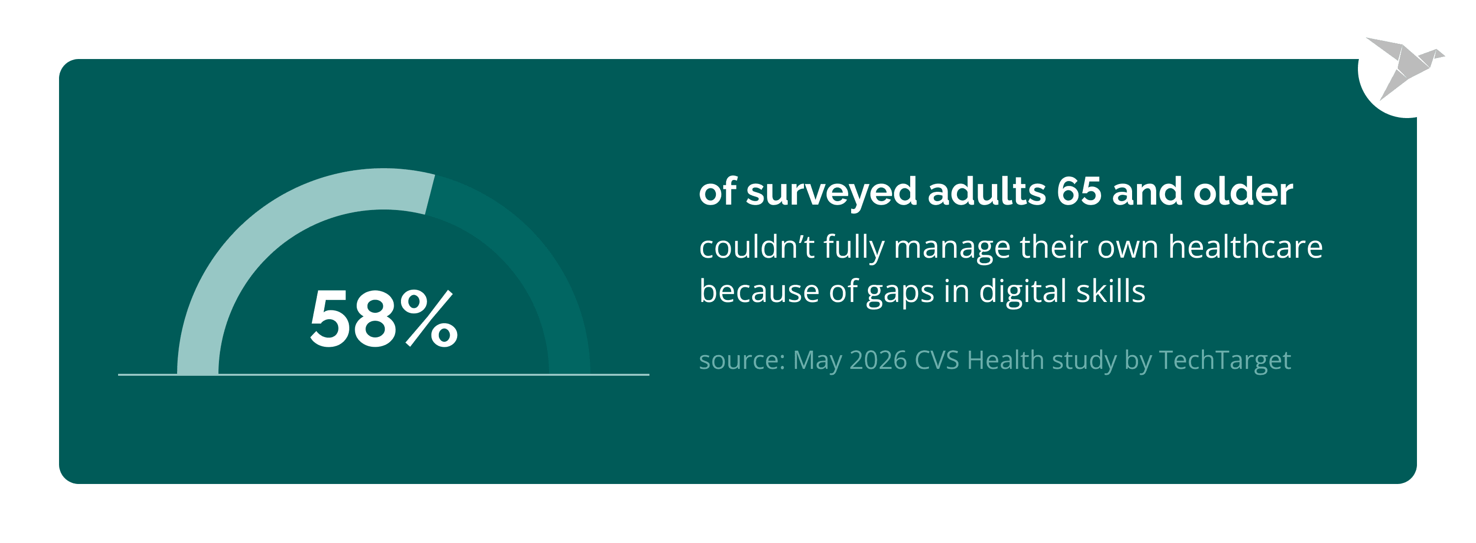
Health literacy is uneven even among people otherwise comfortable with technology. A May 2026 CVS Health study, reported by TechTarget, found that 58% of surveyed adults 65 and older said they couldn’t fully manage their own healthcare because of gaps in digital skills for reading and acting on health information.
Age was only one factor; income and education level moved the numbers too. Plain wording is the baseline a large share of the audience needs to complete a task at all.
Replace or define medical jargon (with examples)
Swapping complex language for straightforward language is the fastest way to close that gap.
Reduce steps and cognitive load in forms and intake
Every extra field or unexplained choice adds friction a stressed reader has to resolve before moving on. Group related questions, explain why a field is needed when it isn’t obvious, and cut anything the product doesn’t actually use.
How Should Healthcare Products Handle Error Messages and Safety-Critical Copy?
An error message in a healthcare app has to tell the patient exactly what went wrong, what to do next, and that their health data is safe, without blame or alarm, and matching how they’re likely feeling in the moment.
What a good healthcare error message includes
Nielsen Norman Group’s error-message guidelines call for a message that states the problem in plain language, explains the fix, and stays polite. In a healthcare product, add one more requirement: reassure the patient that nothing about their care was affected unless it genuinely was.
Writing for safety-critical fields (medication, dosage, results)
Fields tied to medication, dosage, appointments, and results deserve a higher bar than a generic form. Yuliia’s rule of removing ambiguity applies hardest here: a patient should never have to guess what an error near a dosage field actually means.
A copy-risk table: risk level → required review
How Does UX Writing Support Accessibility and Compliance in Healthcare?
Accessible wording is part of accessible design. Clear labels, meaningful link text, and screen-reader-friendly copy make a product usable for patients with disabilities and support WCAG conformance.
Writing for screen readers and assistive technology
A label that reads well visually can still fail a screen reader if it depends on surrounding layout for meaning. Write field labels, error text, and instructions so each one makes sense on its own.
Labels, instructions, and error text that meet WCAG expectations
Descriptive link text ("View your test results" instead of "Click here") matters. So do instructions that don’t rely on color alone, and form errors announced to assistive technology as well as shown in red. All of it falls on the writer as much as the designer.
Consent and privacy wording: accurate, plain, non-alarming
Consent and PHI (Protected Health Information) copy has to be accurate and plain at the same time. A patient who doesn’t understand what they’re agreeing to hasn’t really consented.
UX writing supports accessibility and clear consent, but it does not, by itself, make a product HIPAA-compliant. Getting the engineering and compliance work right is a separate, necessary layer underneath the words.
What Does a Healthcare UX Writing Process Look Like in Practice?
Strong healthcare microcopy comes from a repeatable process: research the patient context, draft copy inside the design, review with clinical and compliance stakeholders, then run usability testing on the wording and iterate.
Write copy inside the design, never after it
Yuliia Malikova’s ideal flow starts in the same early meetings as the designer and product owner, so questions get asked before anything is built.
"In my experience, it’s very rare that copy influences the design, but there are cases like that, and you don’t want the design to have to be redone just to fit the copy. Words are the easiest to change anyway, so it’s a lot easier to fit the copy to the design. But in general, you have to be able to express your opinion and stick to your principles."
Review with clinical and compliance stakeholders
High-risk copy, per the table above, needs a second set of eyes beyond the writer and designer. A clinical or compliance reviewer involved early avoids a late rewrite of copy that already shipped through design review.
Test wording with real patients and iterate
Yuliia tests copy through designer and product-owner feedback first, then, for higher-stakes wording, through A/B tests or a couple of questions folded into user research sessions.
"You can ask the respondents to go through the flow, and you can see where they stumble, where the information is not clear. And then you can ask very specific questions. So you can just observe, ask specific questions, conduct A/B tests, test different variations of copy."
Copy is rarely tested in isolation; it usually rides along with a design change, so the case for testing it has to be made.
How Does TechMagic Approach UX Writing in Patient-Facing Products?
We treat microcopy as part of the build, with senior review on the screens patients depend on most. It’s never a pass at the end.
Tiro.Health: intake forms built for real patients
For Tiro.Health, we built patient-intake forms with accessible UI to WCAG 2.2 on FHIR-compliant data structures, including a form filler and a reusable form renderer. Faster form completion and fewer manual entry errors were the published result: the outcome of clear wording and a well-structured form delivered together.
A telemedicine experience on Medplum
We built a telemedicine platform on Medplum with a Health Gorilla integration. It gives physicians case-review tools and gives patients a path through preventive care. That path depends on the same clarity this guide describes: booking, intake, and result screens a worried reader can actually follow.
What we’ve learned
Copy decisions on patient-facing screens are product decisions. They’re never just a finishing touch. Bringing a writer in early, next to the designer, costs less than rewriting a shipped screen after support tickets pile up.
We are happy to assist

Final Thoughts
Good healthcare UX writing is the wording that keeps an anxious patient completing the task instead of calling support: plain, calm, consistent, accessible, and tested against real people.
Its importance shows up less in praise than in what doesn’t happen. The call that never gets made, the form that gets finished on the first try, the results page a patient can easily understand without a follow-up question.
That’s also why UX writing is more conversational and empathetic than technical writing: it’s built around the words people actually use to talk about their health. A booking screen or a consent form has to feel like it was written by someone who understands what the reader is going through, rather than assembled by the software behind it.
Where is this heading?
Here is what we see in practice and what we can predict based on our experience.
Health literacy gaps will keep shaping product design decisions, beyond content alone
The CVS Health findings above show a meaningful share of patients need plainer wording just to manage their own care, and information architecture carries real weight here too: word choice alone can’t help a patient find wording they never reach.
Error and consent copy will get more scrutiny
As more clinical tasks move into apps and portals, safety-critical wording needs the same review discipline as the underlying workflow. According to a JAMA study covered by AJMC, patient-authored portal messages surged 153% between 2020 and 2025, while office visits rose just 17% over the same period. Unclear copy is one of the details users run into first, and every one of those messages is a task the interface didn’t finish on its own.
Writers will keep moving earlier into the design process
Yuliia’s account of her ideal workflow, writer in the room from day one, is becoming the norm on teams burned by a late rewrite. UX writers participate in UX research and usability studies for the same reason: they need to interact with real users to know which words are actually helpful instead of relying on a spec alone.
Accessibility and plain language will keep converging
The habits that make copy readable for a stressed patient tend to make it work better for assistive technology too, and together they have a significant impact on faster sign-up and task completion for the people who need it most.
Healthcare product teams will treat UX writing as a specialty in its own right
Demand for UX writers is increasing across various industries, and many major tech companies actively hire UX writers as a named role rather than folding the work into design or marketing. That shift matters for healthcare products specifically: a content strategy built by industry experts who understand clinical workflows and interface patterns.
All of these turn business goals like lower support load and higher form completion into wording patients can trust.
FAQ

UX writing in healthcare is the practice of writing the buttons, labels, error messages, and confirmations. In other words, the UI content that shapes a patient-facing product's user interfaces. This helps people complete tasks like booking, intake, or reviewing results without confusion.
In healthcare technology, that's the UX writer's job, and it carries extra weight because the reader is often stressed, unwell, or unfamiliar with medical terms.
Poor UX writing drives task abandonment, causes avoidable form errors, and pushes patients toward a support call instead of finishing in the app. Clear microcopy helps users understand what's being asked of them and can lead users through booking, intake, consent, and results screens, building trust in a product handling their health information.
The core practices for effective UX writing are plain language tested against a set reading level, one consistent term for one thing, a calm and human tone, and action-first button labels. Many UX writers find that writing copy inside the design process, not after screens are built, and it makes those practices stick.
A good healthcare error message states the problem in plain language, explains what to do next, and reassures the patient their health data is safe, without blame or alarm – the goal is to inform users, not alarm them. Fields tied to medication, dosage, or results deserve an extra layer of clinical or compliance review, drawing on the technical expertise of both writer and reviewer, before they ship.
Clear labels, meaningful link text, and screen-reader-friendly copy support WCAG conformance and make a product usable for patients with disabilities. Ongoing ux research with real patients tests whether that copy actually works. UX writing supports accessibility and clear consent, though HIPAA compliance depends on the engineering and compliance work underneath it.
TechMagic treats microcopy as part of the build on patient-facing products like Tiro.Health and BeHuman's Medplum-based telemedicine platform, with senior review on the highest-risk screens. Writers work alongside designers and clinical stakeholders from early in the process rather than filling in text at the end.